
Petit Duc
Petit Duc is a travel emissions calculator focused on the carbon footprint of company events and offsetting those carbon emissions.
Product Type
Mobile and Desktop User Form
Role
UX / UI Designer
UX Researcher
Tools Used
Figma, Figjam,
Figmake
Duration
Current
Problem
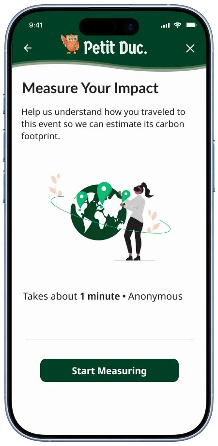
Petit Duc wanted to provide users with a travel form that felt intuitive and easy to complete that also aligned with their brand identity and values.
Solution
I built off of the original Petit Duc form implementing the visual identity of Petit Duc while also consolidating key information into just a few steps in order to provide users with the most streamlined experience possible.
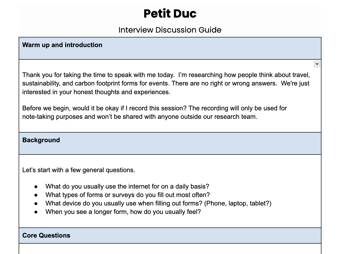
Conducting Research
The first step for creating the Petit Duc Travel Emissions Form was to connect with my client on previous research and conduct my own user research to better understand the product.
Step 1/5: Client Review
Goals:
Catch up with where the Petit Duc product is and understand the goals and needs of the client.
Takeaways:
We reviewed user stories prepared by the client prioritized from low to high
The scope of our project was defined for the team
The product background and user pain points were clarified
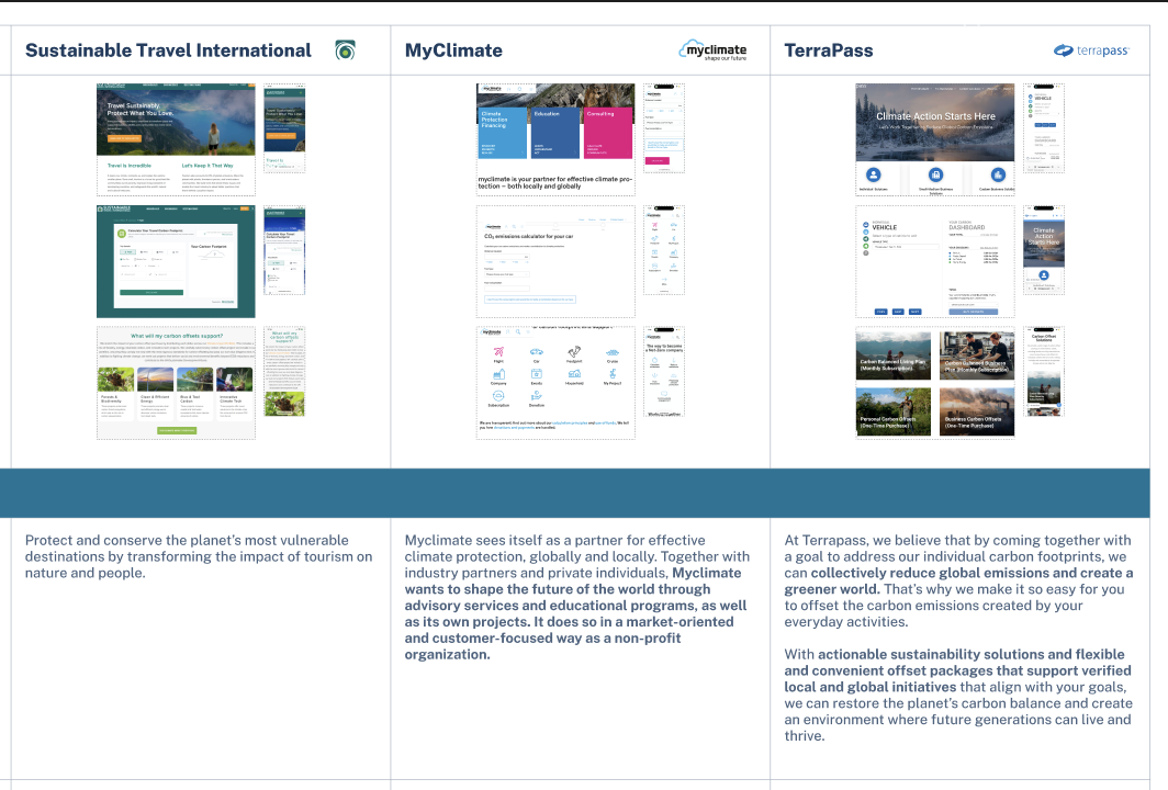
Step 2/5: Competitive Analysis
Goals:
Understand how other companies are approaching the carbon emissions field as well as what the common patterns and best practices are.
Key Insights
Users want to trust that their money is being used properly for carbon offsetting
The ability to calculate carbon emissions for multiple travel modes is necessary
Users are looking for a low-cognitive load and straightforward experience
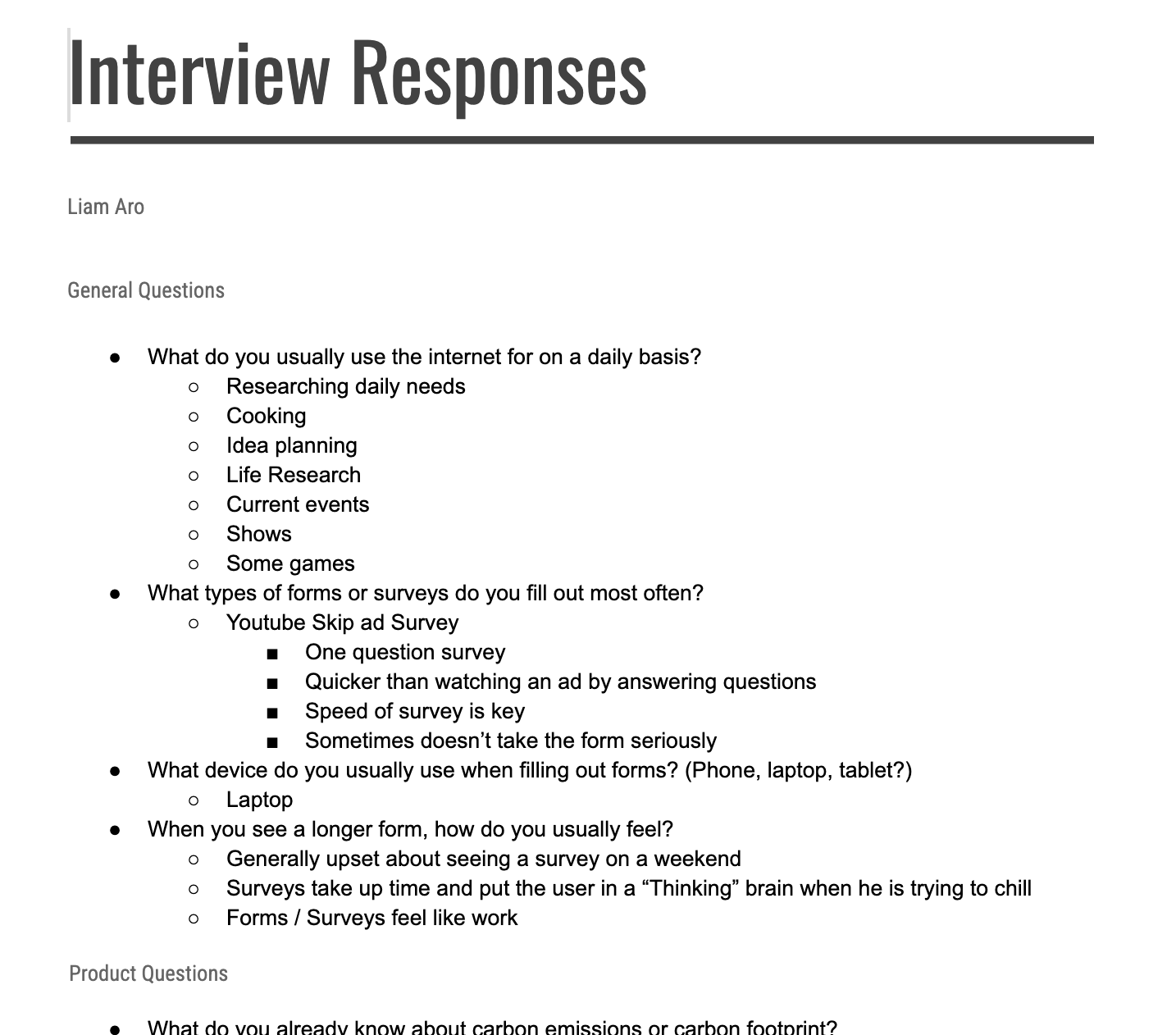
Step 3/5: User Interviews
Goals:
Gauge the general knowledge of carbon emissions
Identify travel patterns for potential users
Clarify user expectations and needs for this product
Key Insights
General knowledge of carbon emissions is low, more of a good thing vs. bad thing understanding
Users would be willing to monetarily offset emissions if they can trust the company
Users are looking for results and proof that their donations are being put to use
A short form length is ideal, around 30 seconds to a minute
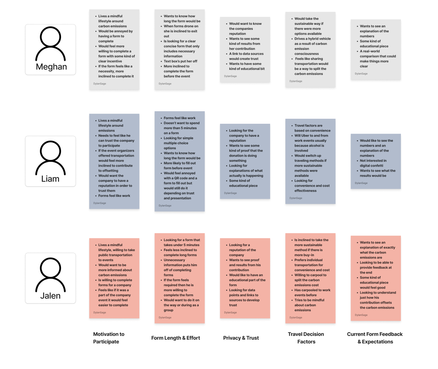
Step 4/5: Affinity Map
Goals:
Identify patterns and key themes
Prioritize key features and user needs
Key Insights
Users prefer short form experiences where information is clear and concise
Establishing trust with the users is a key factor in encouraging carbon offsets
Users are looking for some kind of educational piece to help them understand carbon emissions
Results and proof are key to establishing trust between the users and the company
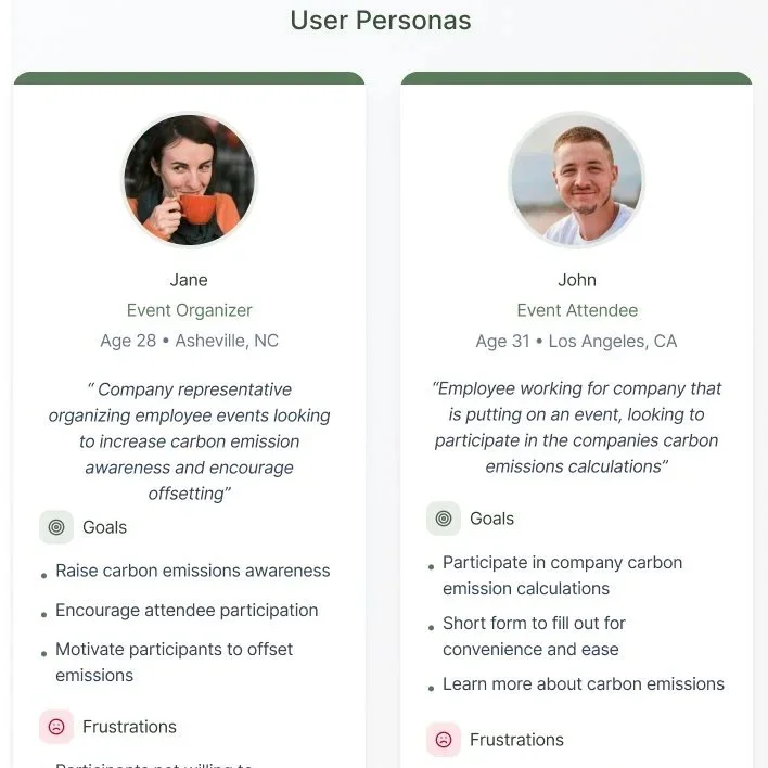
Step 5/5: User Personas
Goals:
Define target audience and users needs
Identify the scope of my product
Prioritize features of the product and hierarchy of problems to solve
User Personas
Event Organizers
Event Attendees
Additional Methods of User Research
Research Plan
Project Timeline
Business + User Goals
Designing The Product
After completing my product research and analyzing the data I began to design the UI for the Petit Duc Travel Flow.
Design Vision
The visual direction for this product is based on the Petit Duc visual identity and the simplification of the user form.
Color and Typography
Step 1/8: Visual Identity
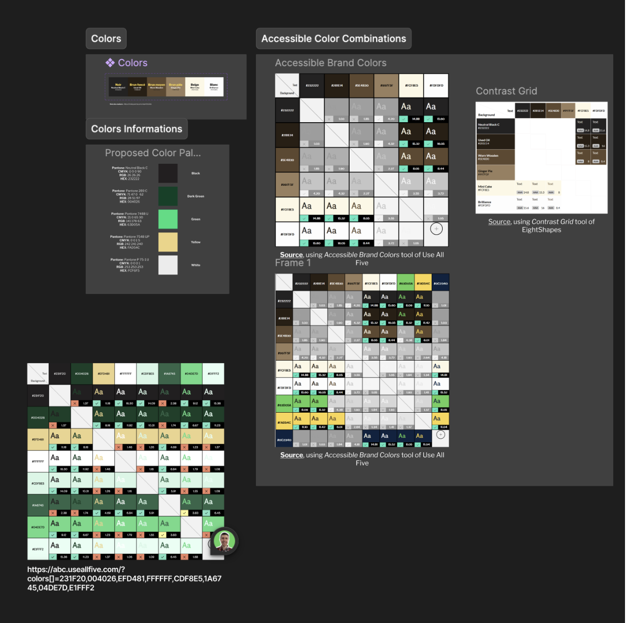
The Petit Duc company already had an established brand identity with colors provided as well as a logo. We also used the Government of Canada Design System for key components and fonts.
Government Of Canada Design System
Petit Duc Brand Identity
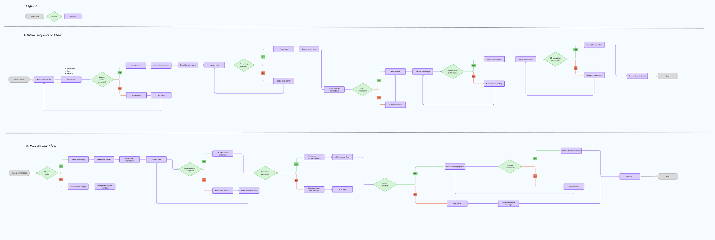
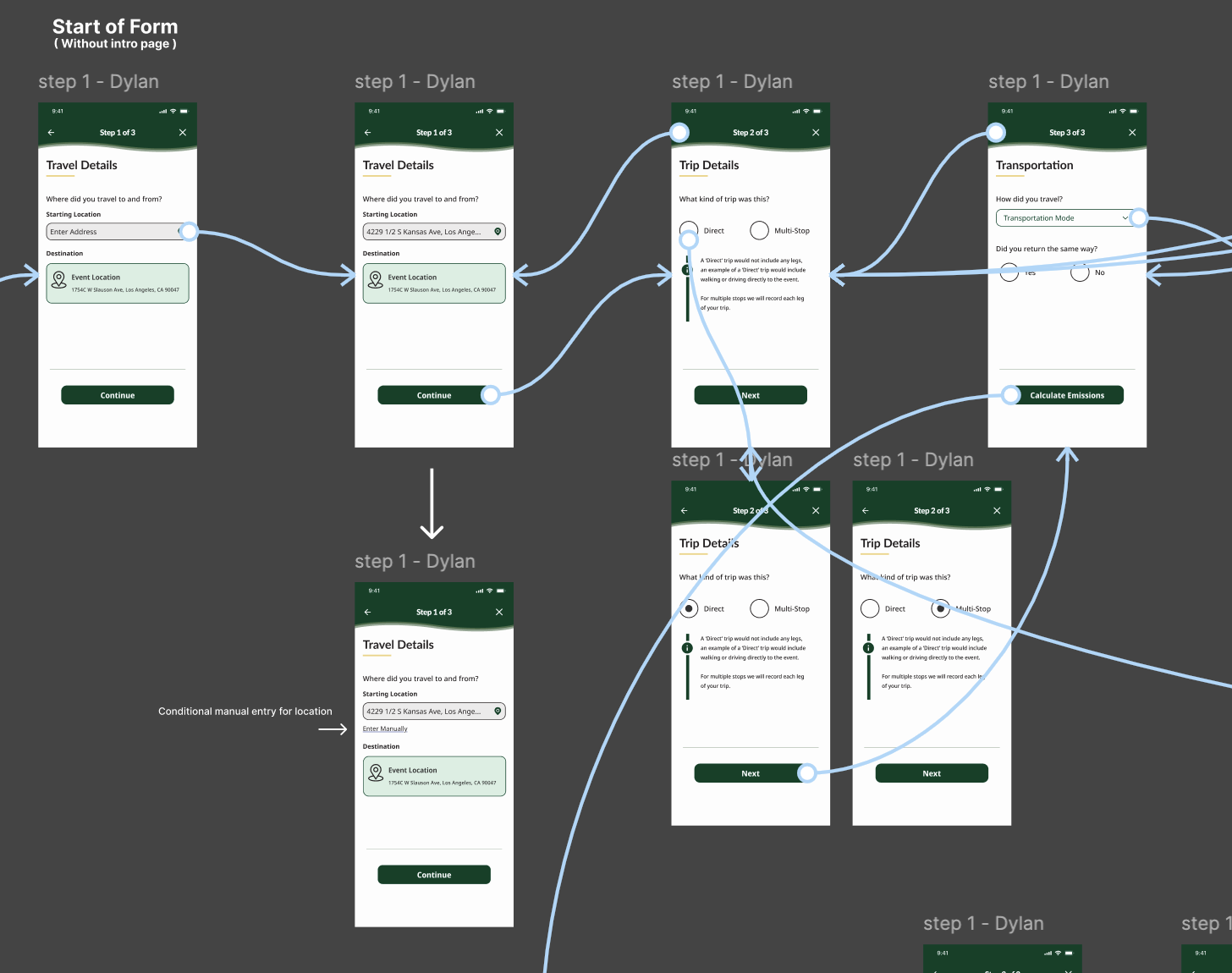
Step 2/8: User Flows and Task Flows
With the visual identity provided for our team we set out to create user flows and task flows in order to better understand the flow and navigation of our product.
My teammates focused on user flows mapping out a larger experience of the Petit Duc project where I prioritized a task flow that represented the travel form which I was working on.
Task Flow
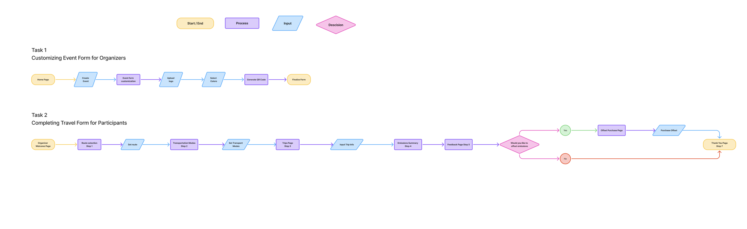
User FLow
Step 3/8: Low-Fidelity Wireframes
Using a pre-existing form provided by Petit Duc the team and I created two potential low-fidelity mockups to be discussed and reviewed with the client.
Original Form
Low-Fidelity Wireframes
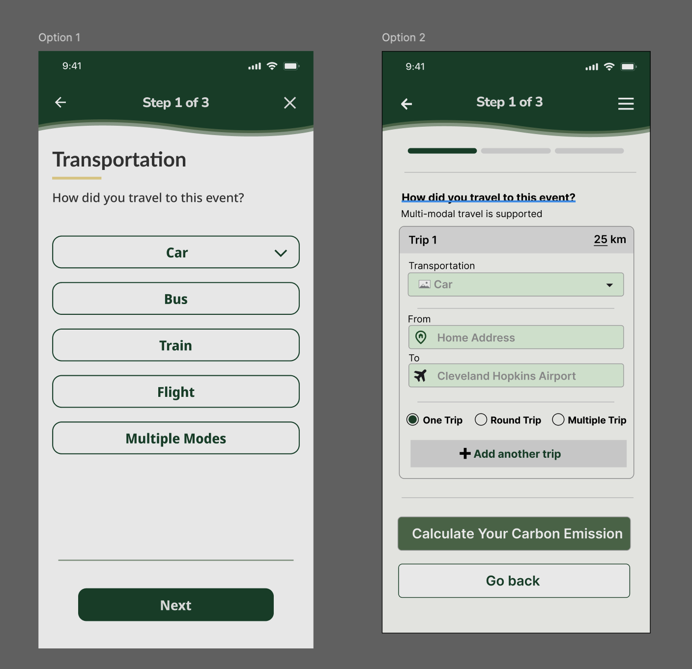
Option 1 is the form I presented, initially it was in an incomplete state and Option 2 was chosen. I felt strongly about my design decisions and iterated upon my wireframes then presented them to the client in a more complete state which resulted in the client choosing to go in the direction that I proposed.
Step 4/8: Mid-Fidelity Wireframes
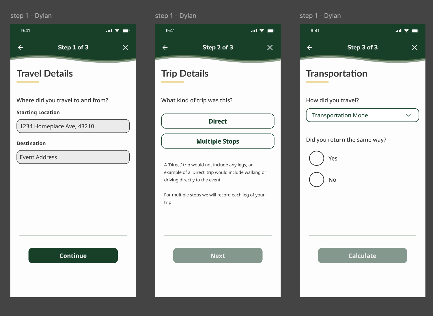
After solidifying the direction of the travel form I combined ideas from both versions and utilized client, mentor, and peer feedback to create mid-fidelity wireframes.
Step 5/8: High-Fidelity Wireframes
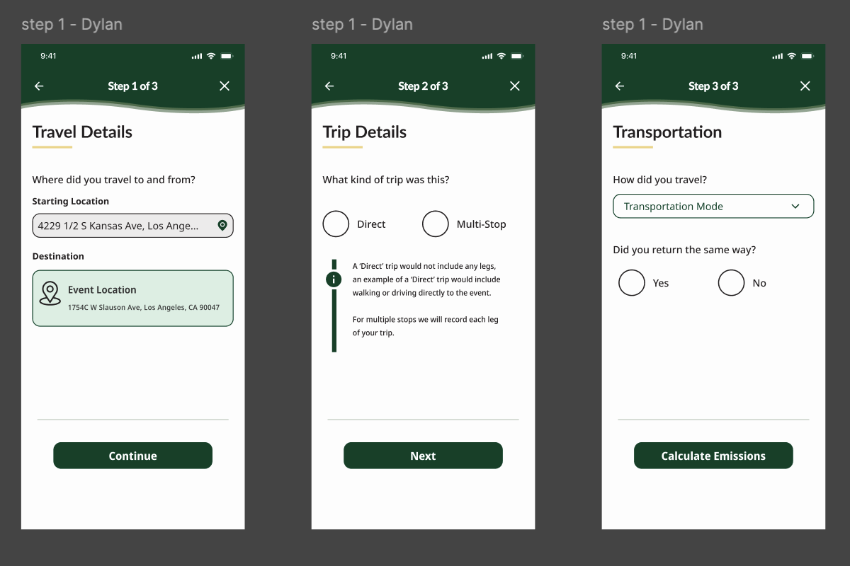
Utilizing feedback from client, team, and mentor meetings, I iterated upon my designs to create High-Fidelity wireframes for prototyping and user testing.
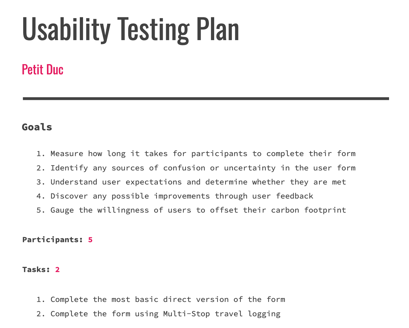
Step 6/8: Prototyping and User Testing
Next I created functional prototypes to be used for user testing in order to gather useful feedback and insights.
User Testing
Goals:
Identify any problems or points of confusion experienced by users
Gauge the overall effectiveness of the form
Determine the average completion time of the travel form for users
Gather data to justify the design decisions that I made
Key Insights
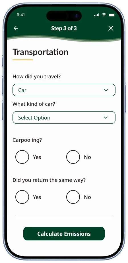
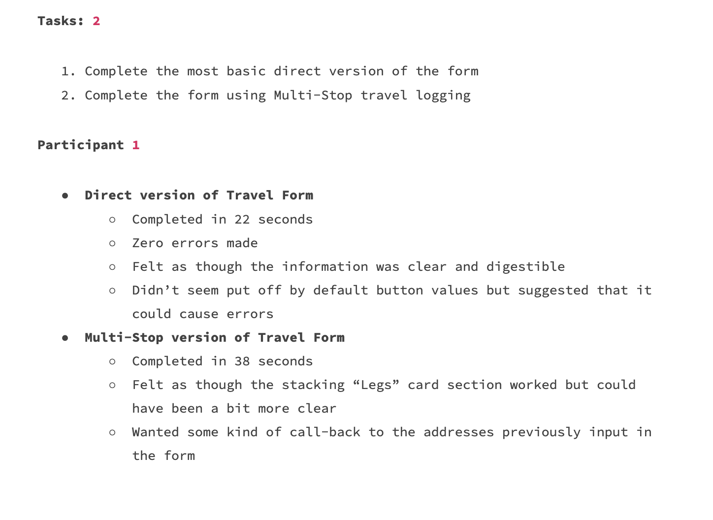
Users were able to complete the form in less than a minute for both the direct travel form and multi-stop form
45 second average for direct, one minute for multi-stop
The language used for action buttons needed a change for user confidence and understanding
Users did not feel overwhelmed by the information that they were being asked to provide
Step 7/8: Priority Revisions
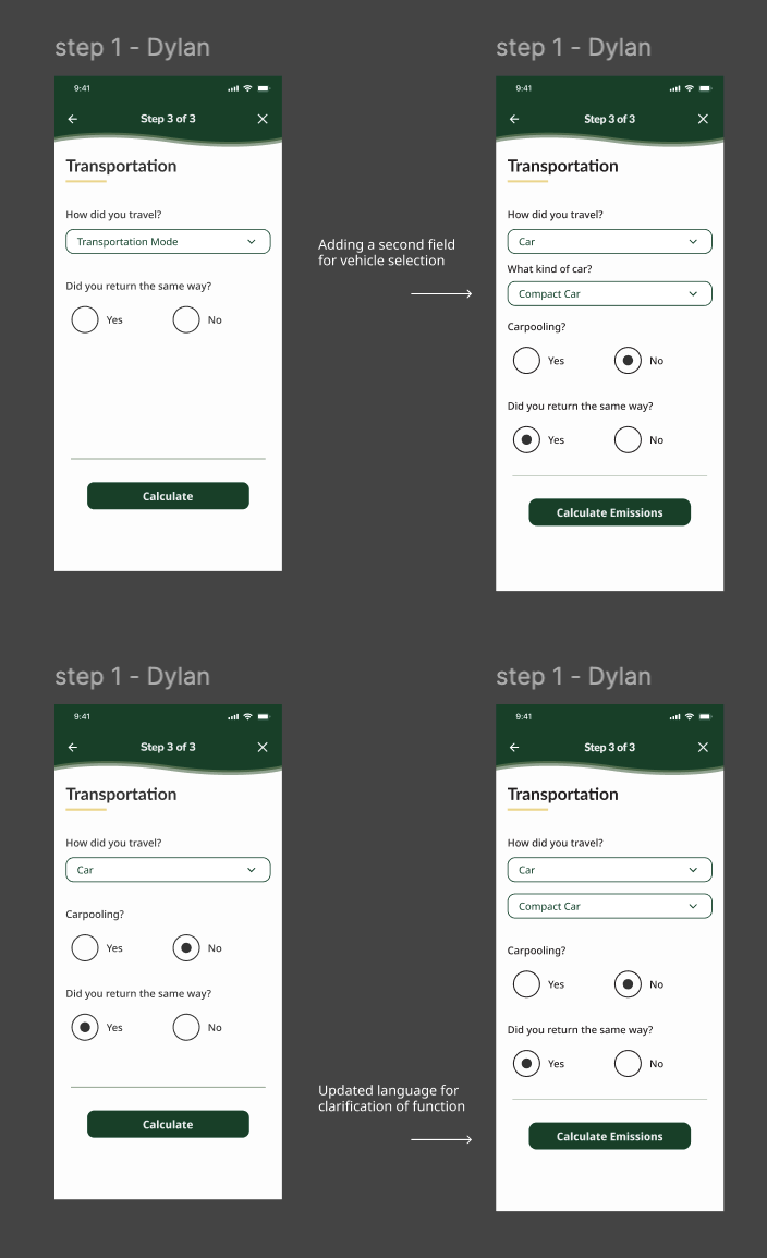
After conducting user testing I reviewed the feedback with my team and client then carried out priority revisions updating the wireframes to a higher functionality.
Revisions included and were not limited to:
Addition of secondary category option field
Updated language of action buttons
Improved consistency throughout flow using GCDS components
Removed default states from selection fields
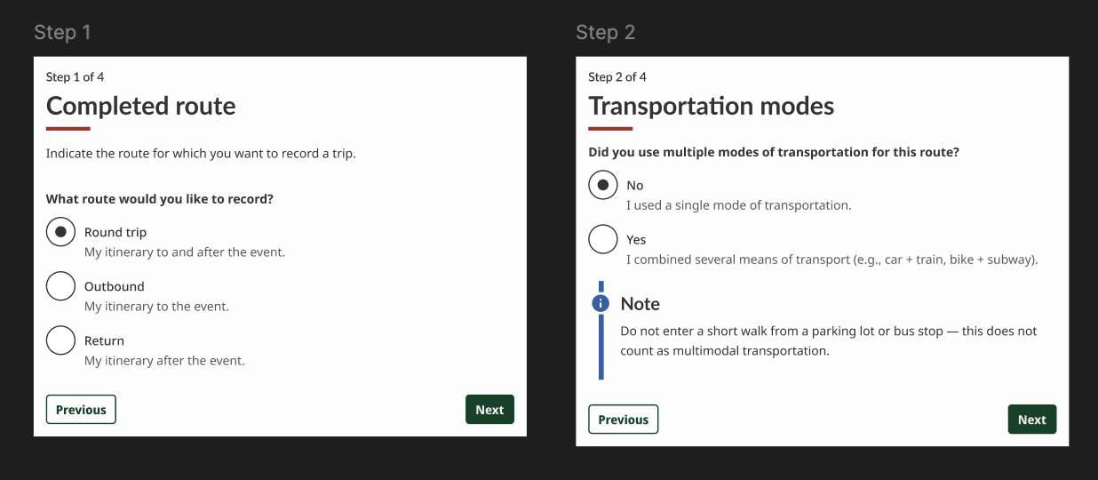
Step 8/8: Current Fidelity
Once the priority revisions were complete I reviewed with my team and presented the designs to our client.
The current version of the user flow was approved for our required deadline.
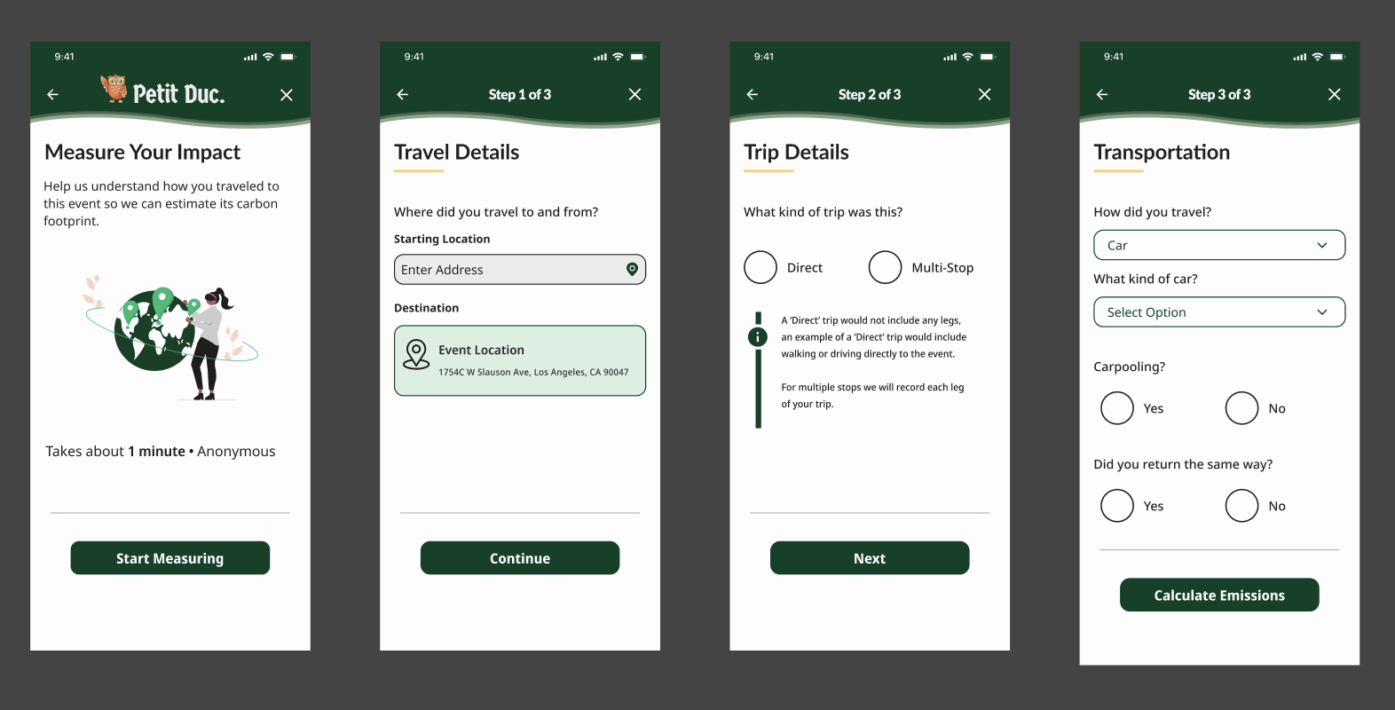
Client, user, mentor and team feedback was considered and implemented throughout each step of this design process.
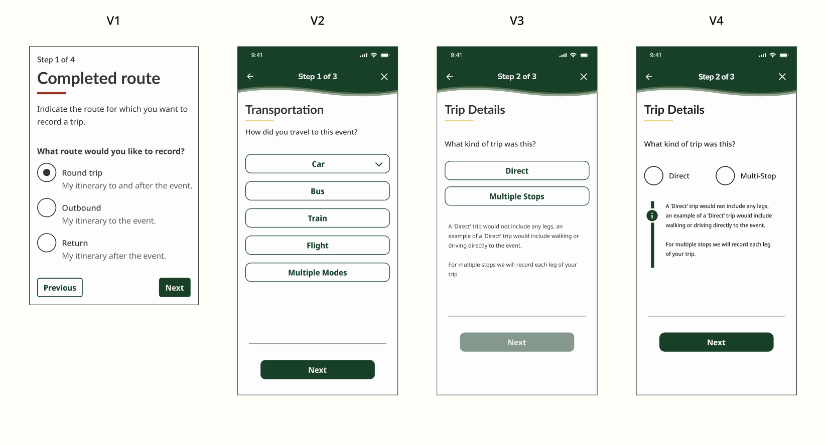
Version Timeline
Next Steps and Lessons Learned
Next Steps
Continue working on the user form / flow.
Review insights with my client and then conduct user testing.
Implement priority revisions.
Lessons Learned / Reflections
When I presented my design idea to my client and team it was very unfinished in a way that did not fully represent the concept I was going for. For the future I will make sure to solidify my ideas before presenting them to any team or client.
I learned how to work cohesively with a team and collaborate with other designers in a space where there can be competing design directions.
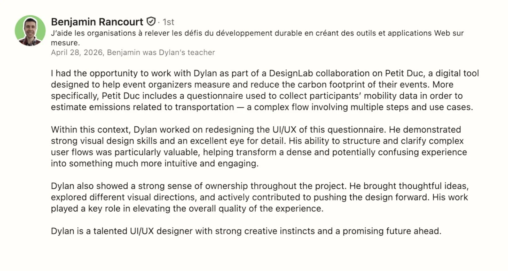
Client Testimonial

This product was created as my final capstone for the DesignLab UX Academy. I am continuing to work on this product with Petit Duc currently as a freelance collaborator.