
MoneyMoves Budgeting App
MoneyMoves is a budgeting and organizational app specifically tailored to the experience of budgeting for moving to a new place which helps keep users organized and stress free.
Product Type
Mobile First App
Role
End To End Designer
Tools Used
Figma, Figjam,
Duration
12 Weeks
Problem
Keeping track of the expenses of moving to a new place poses many challenges for users. There are multiple tools that can be used though there is not a product that offers an all-in-one solution. That is where MoneyMoves comes in.
Solution
I created a product that features the best practices from both budgeting apps and organizational apps to provide a platform for users to organize and track each expense that comes along with moving to a new place.
Research Methods
Step 1/7: Questionnaire
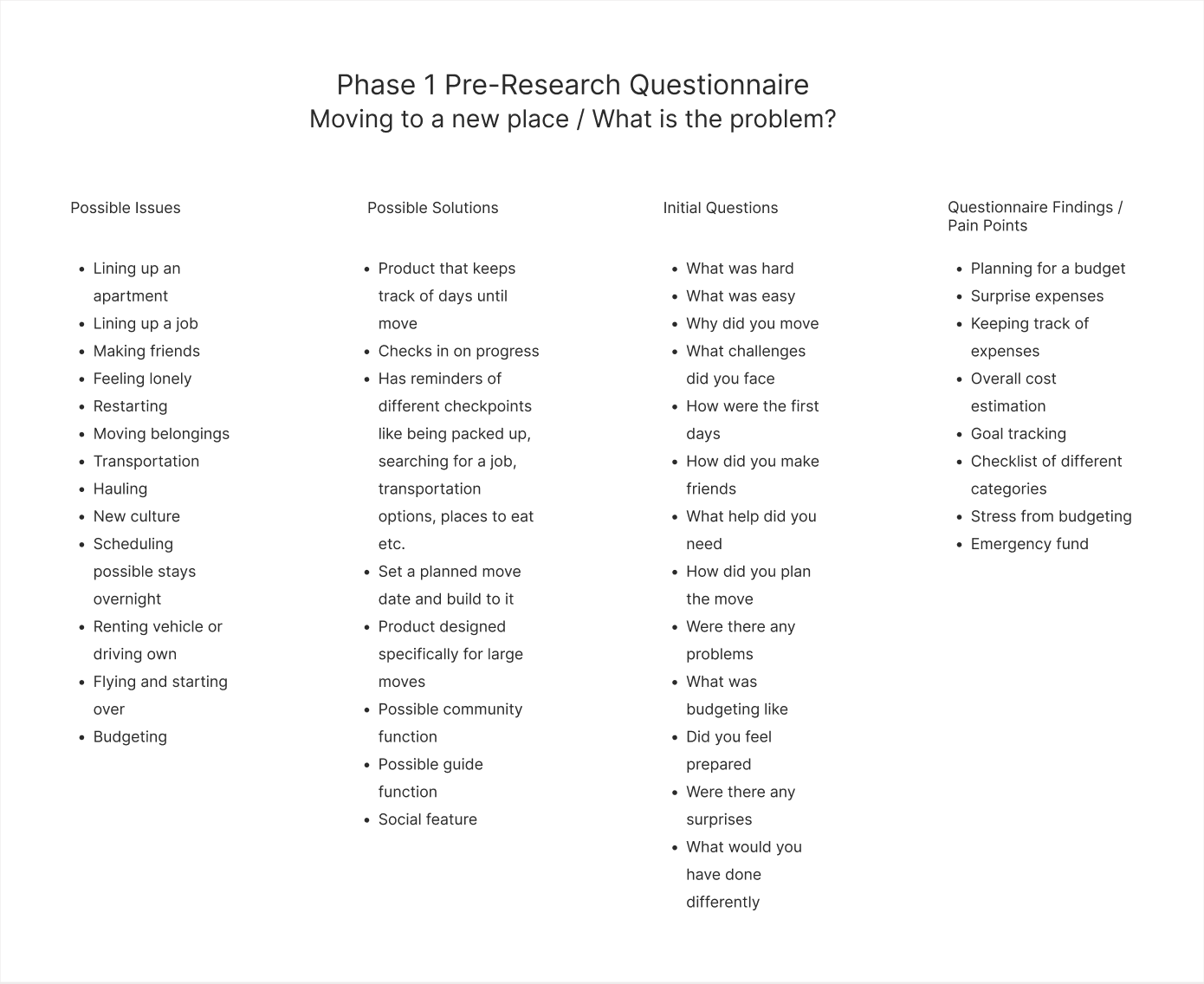
The first order of business was to identify the problem to be solved. To do this I conducted a voluntary questionnaire with open questions about moving to a new place.
Goals:
Uncover common themes and pain points from participants.
Participants: 5
Questions: 13
Step 2/7: Synthesizing Responses
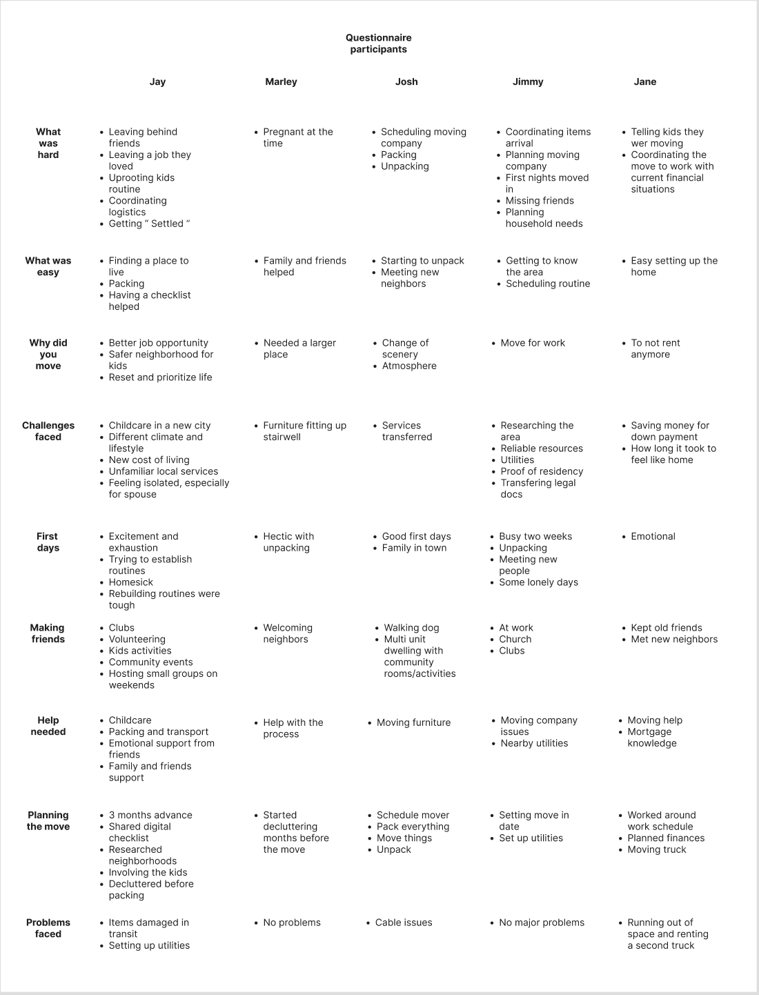
After completing the questionnaire I gathered all of the participants answers into one place and combed through each answer to find common themes and pain points.
Goals:
Identify recurring themes and pain points.
Results:
Many participants either directly or indirectly expressed frustrations and concerns about budgeting for a move. I decided to follow this direction for my product.
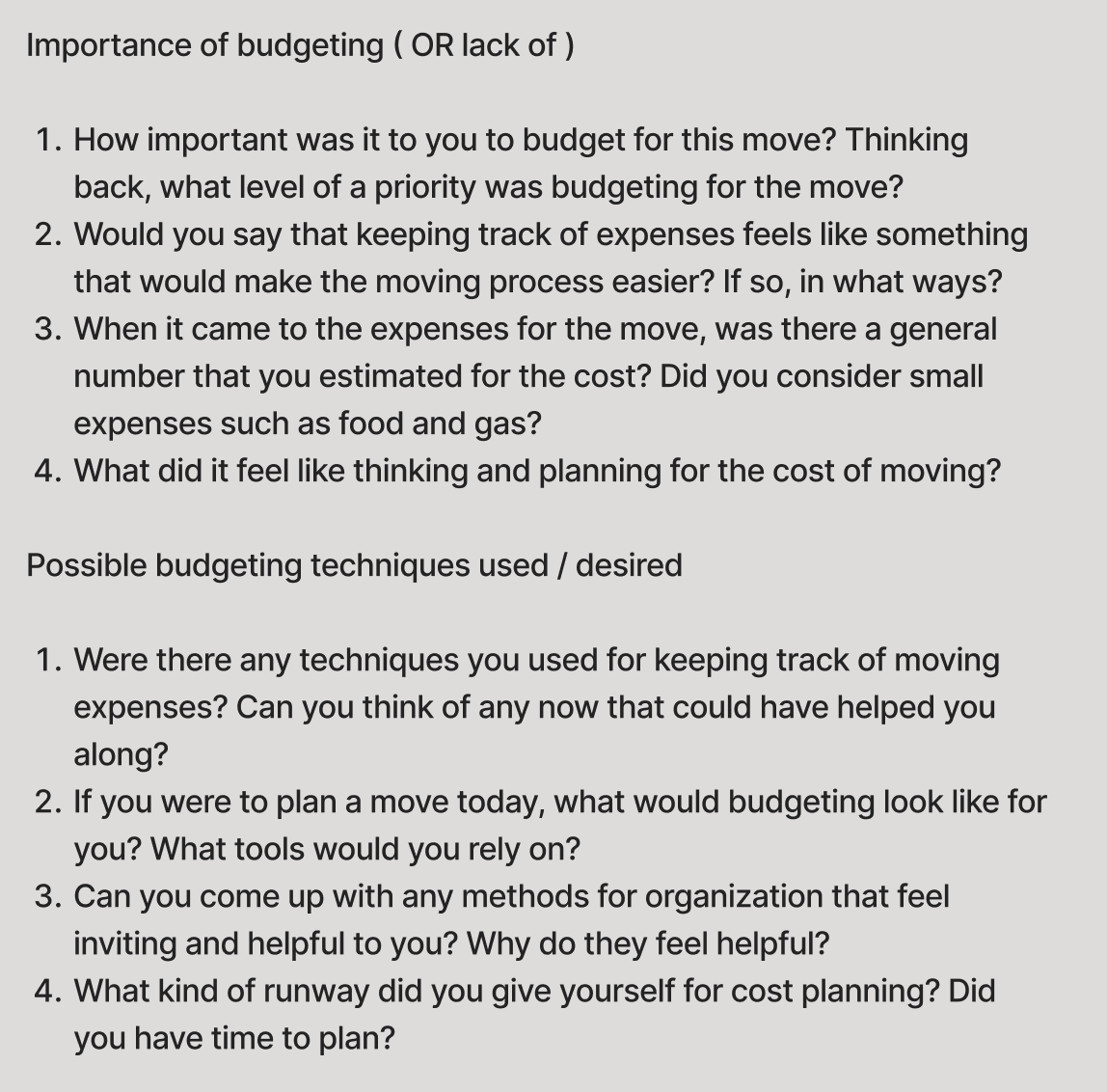
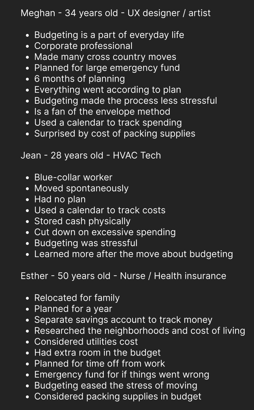
Step 3/7: Conducting user interviews
After completing my questionnaire and identifying the pain points of my users I conducted user interviews more specifically tailored to the problem space of budgeting for a move.
I included participants from different age groups and different walks of life.
Goals:
Further define the purpose of this product.
Participants: 5
Questions: 18
Step 4/7: Affinity Mapping
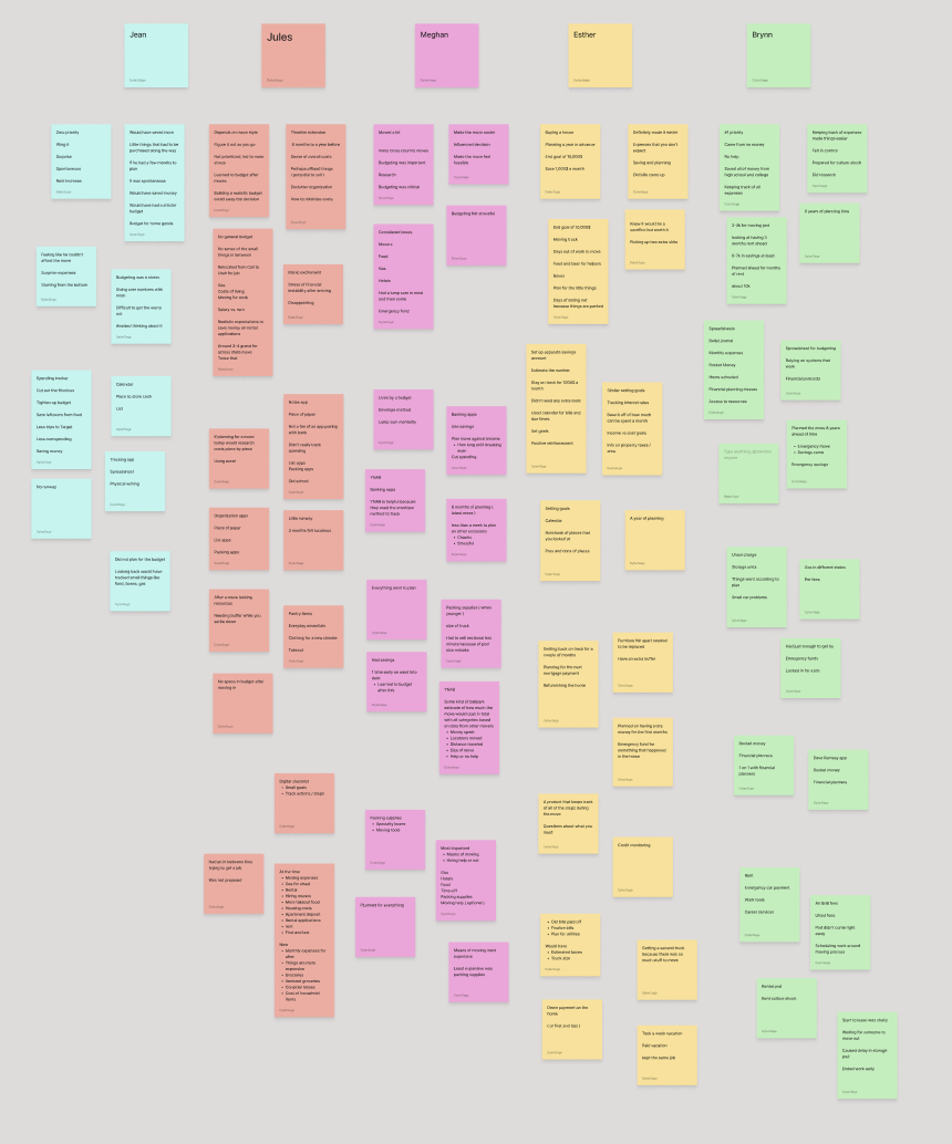
In order to effectively pull insights from my interviews I created an Affinity Map to organize quotes and responses from each interviewee.
Goals:
Group interview responses in order to further identify themes and pain points.
Step 5/7: Interview Debriefs
The final piece of the interview process defined my user base further and helped identify features and functions that users desired.
Goals:
Further define the needs of the users in order to create User Personas.
Step 6/7: User Personas
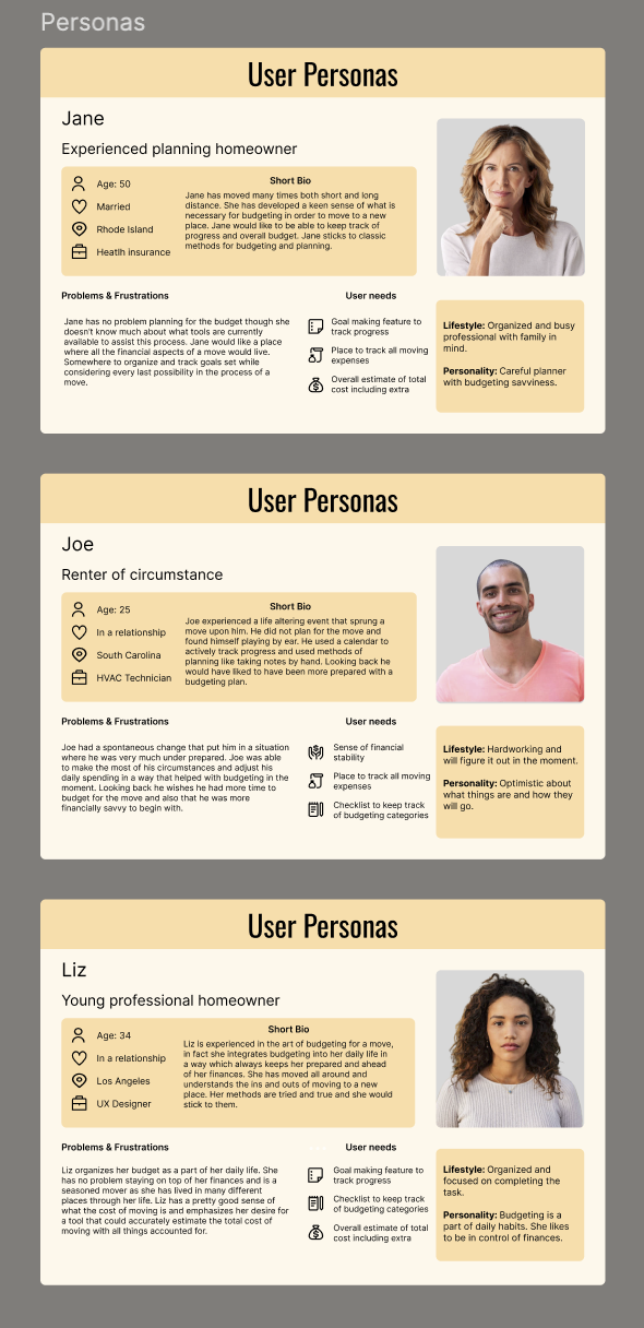
After completing my interview debriefs I created user personas based on which participants best represented my target audience.
Goals:
Specify the range of users that would find this product useful.
Results:
I identified 3 different user personas helping me further narrow down the scope of my product.
Experienced Homeowners
Renter of circumstance
Young professionals
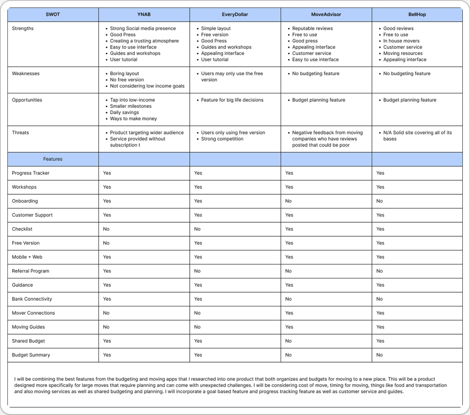
Step 7/7: Competitive Analysis
The next step after completing user research was to conduct competitive analysis to identify common patterns and themes used by products in both the organization and budgeting fields.
Goals:
Identify and prioritize features and practices best suited for this product.
Results:
Necessary features included.
Budget tracker
Budget categories list
Calendar
Bank Connectivity
Onboarding
Checklist
Additional Methods of User Research
Interactive Card Sorting with participants to establish commonalities in user thought processes
POV and HMW statements to discover problem spaces and their solutions
Designing The Product
After completing my initial user research and analyzing the data I began to design the UI for MoneyMoves.
Design Vision
The visual direction for this product was aimed at invoking a sense of trust and ease.
For this I chose to work with the color green, which often represents calmness, safety, and success.
Color and Typography
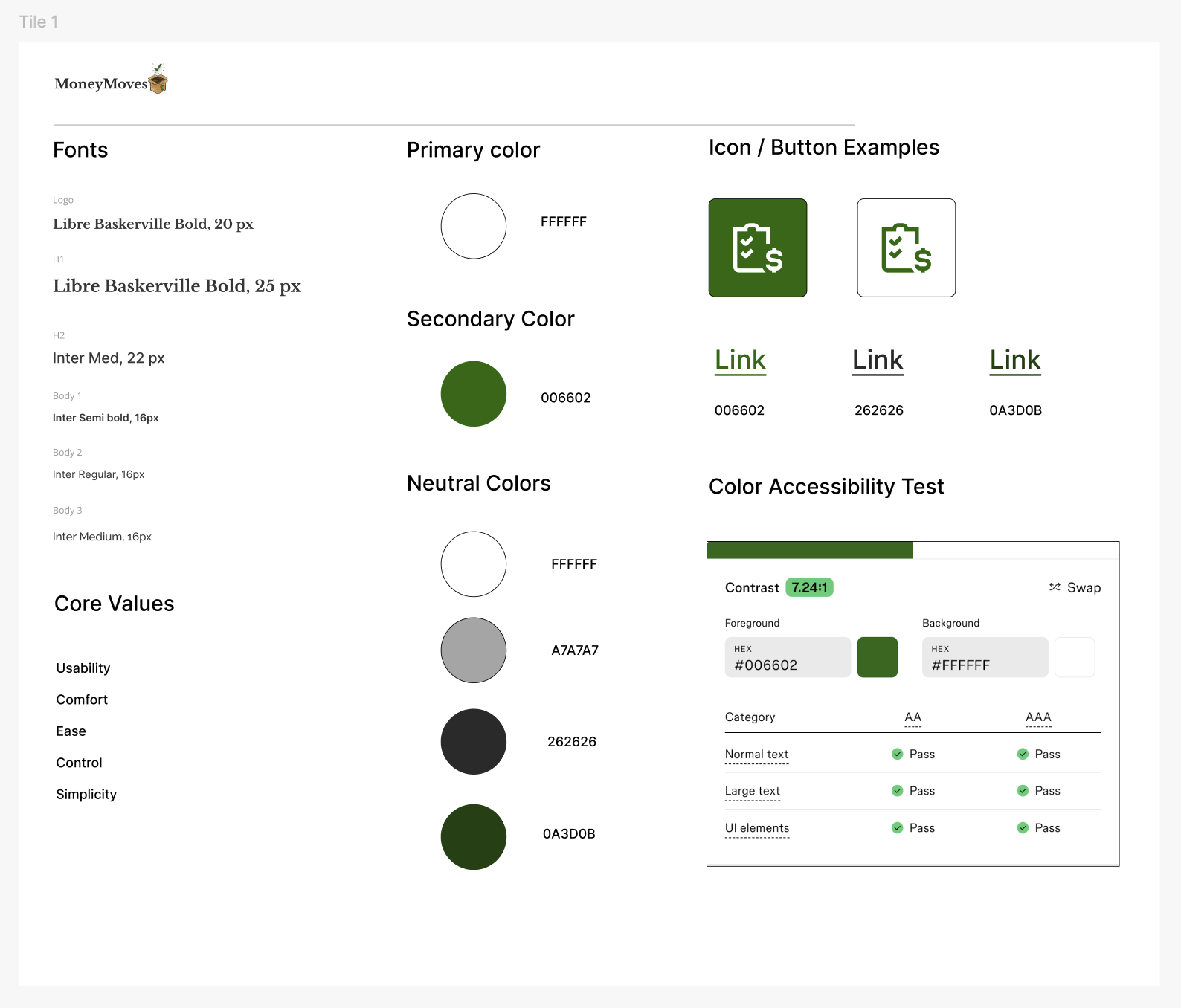
Step 1/8: Style Tile
I created a style tile with a color palette that felt both modern and earthy. Using forest green as a primary color and versions of white and black that incorporated green hues.
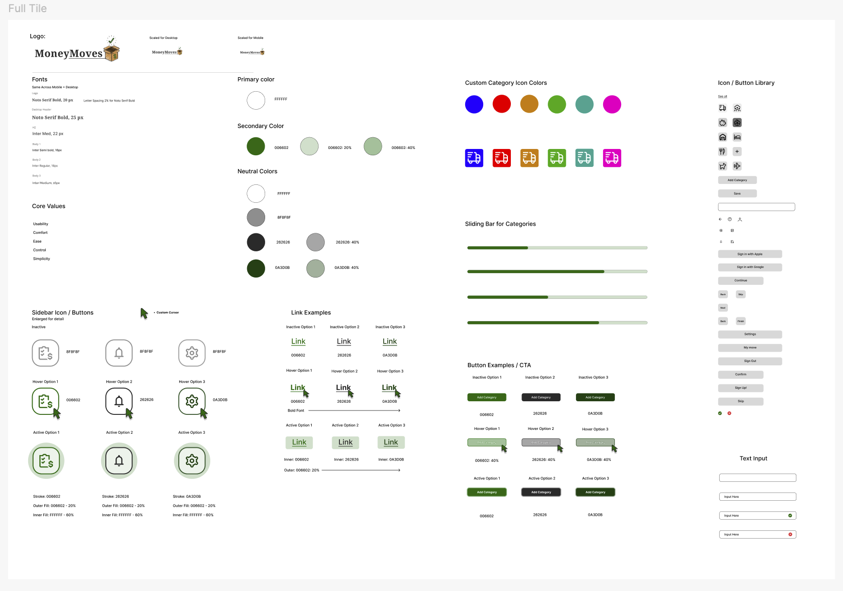
A second more in depth version of the style tile was created featuring updated typography and examples of button states as well as an expanded color palette.
Step 2/8: Sketches
After referencing best practices and patterns from similar products I began to mock up digital sketches.
Step 3/8: User Flows and Task Flows
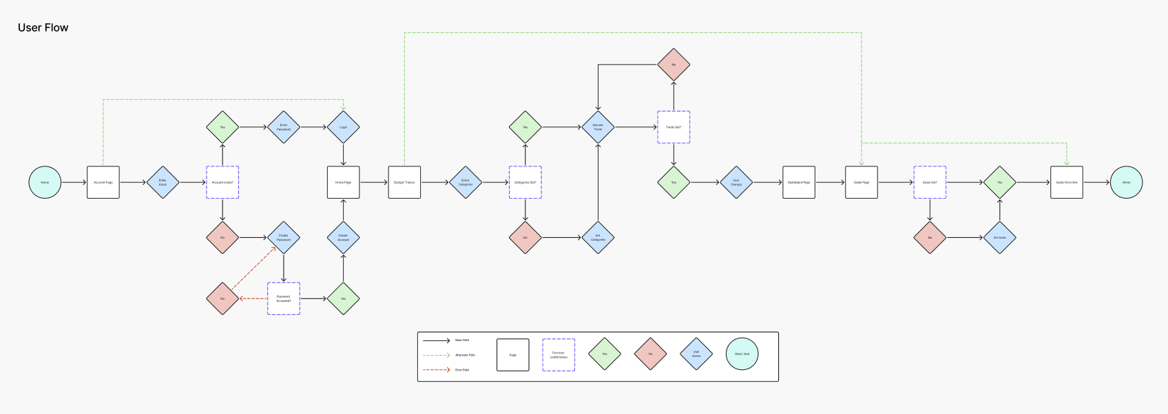
After mocking up initial sketch ideas for this product I moved forward by drafting user flows and task flows to help me prioritize features and maximize usability
I included three primary task flows for my product in this representation.
Create a profile
Login
Set Budget Category
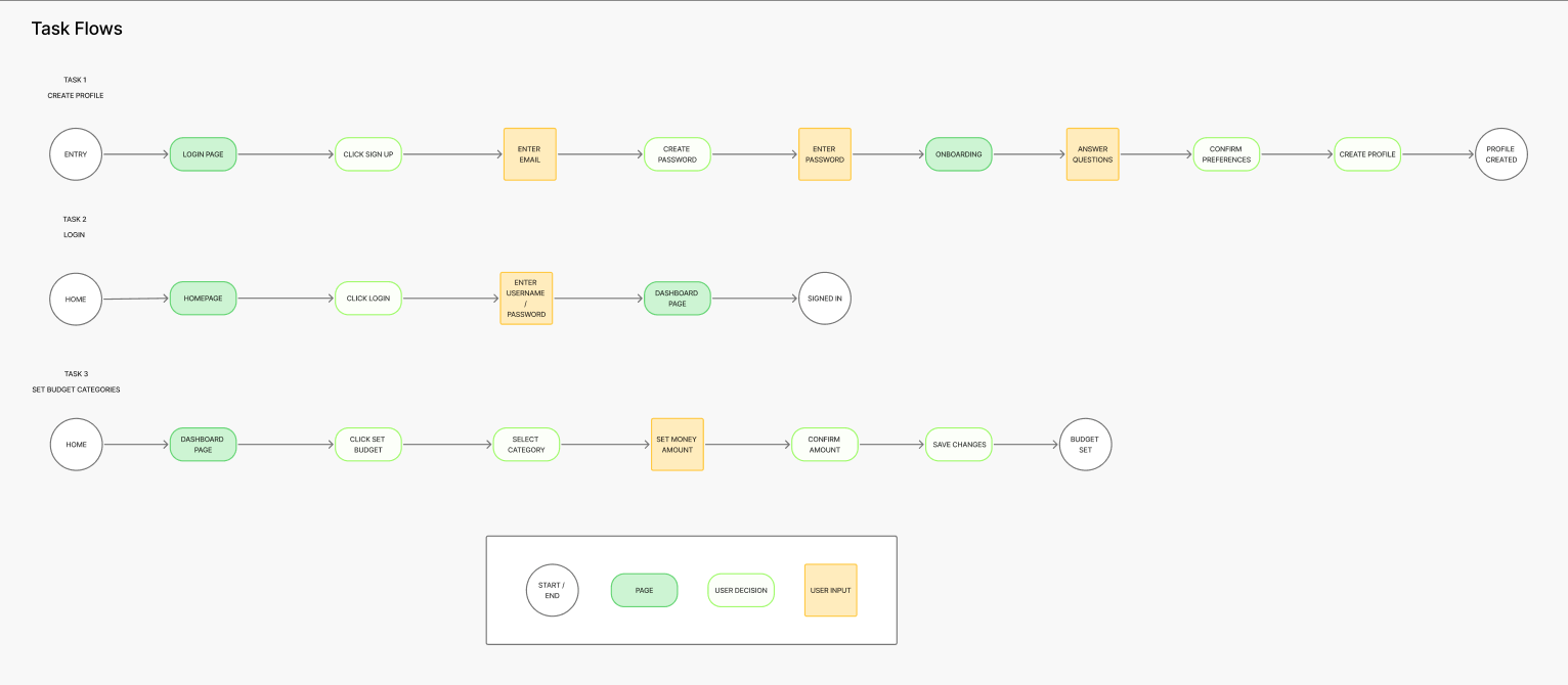
The User and Task flows provided clear direction for the navigation of this product, the next step was to create Lofi Wireframes.
The User Flow displayed below illustrates the user’s journey from start to finish completing an essential function of this product, setting the budgeting categories and allocating funds.
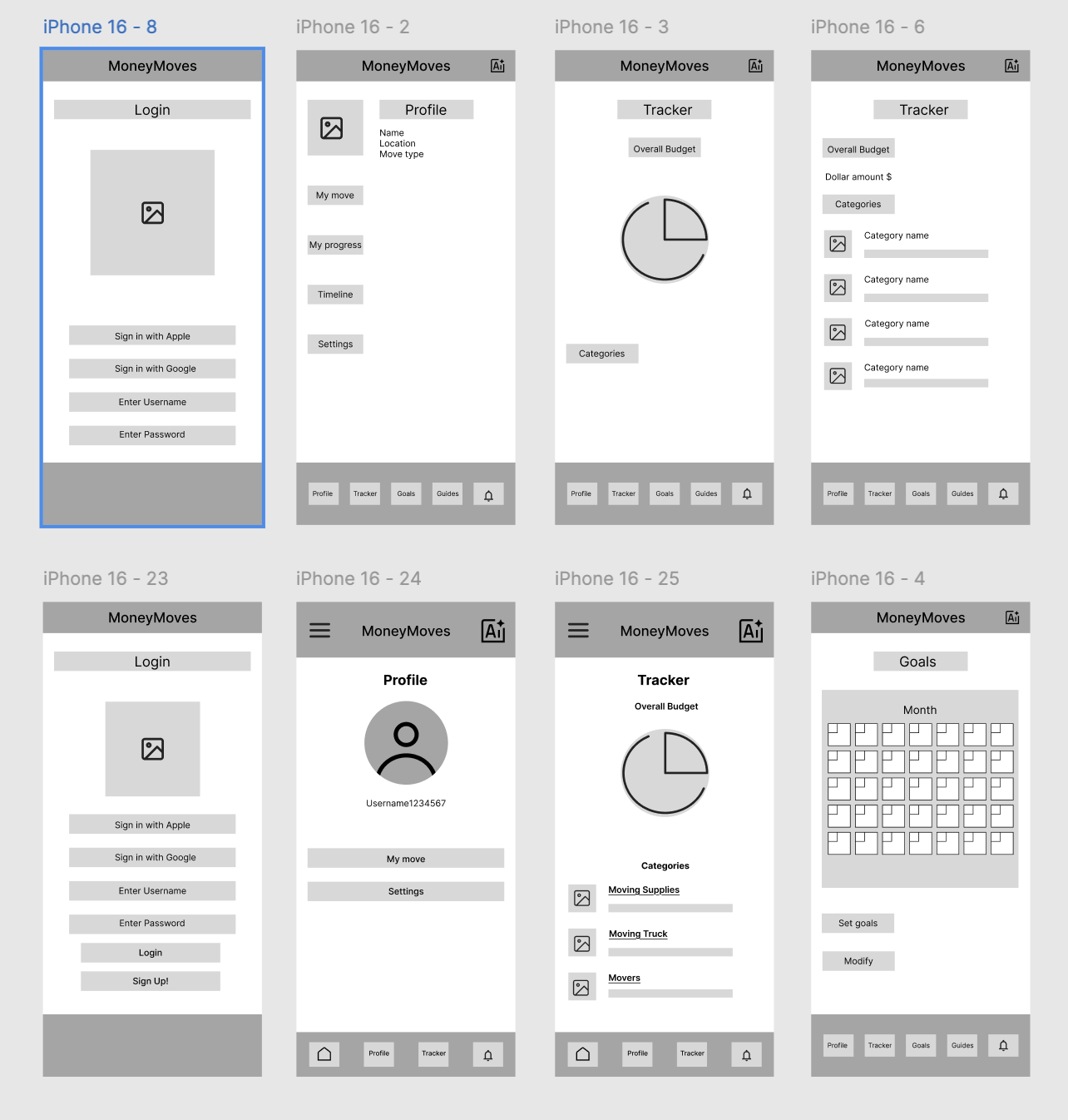
Step 4/8: Lofi Wireframes
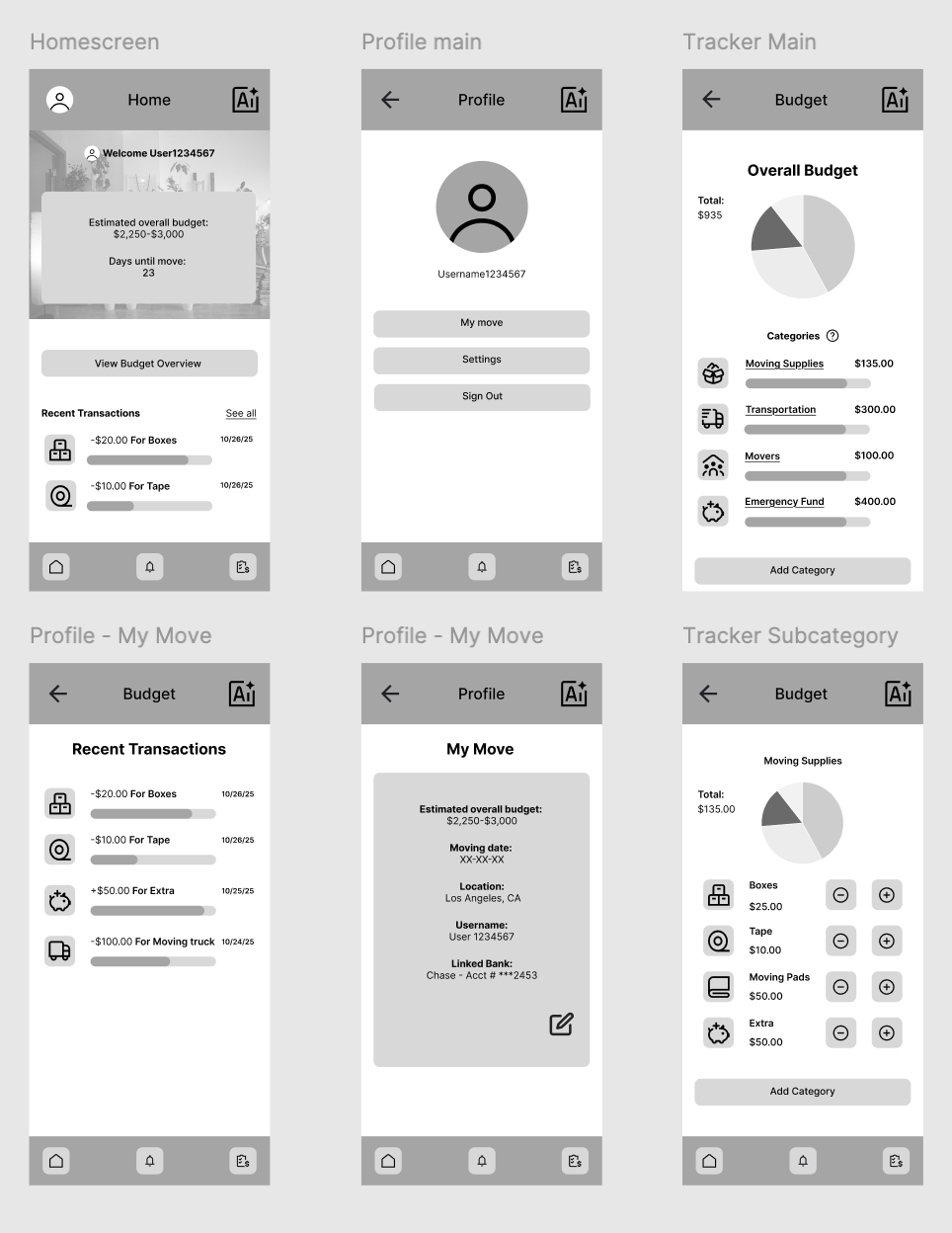
I continued to iterate upon my design creating lofi wireframes that prioritized key features.
Features Included:
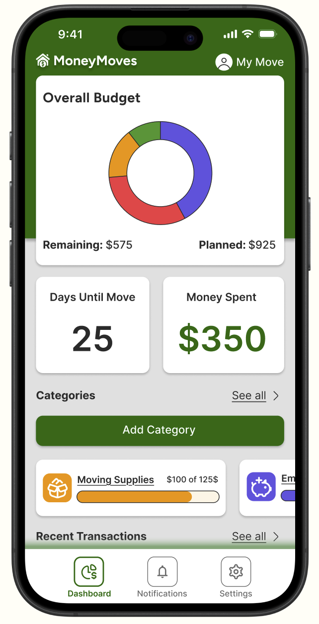
Profile ( My Move )
Budget Tracker
Transaction History
Step 5/8: Midfi Wireframes
I began to apply the color theme and typography to my product while also creating a more in depth UI experience.
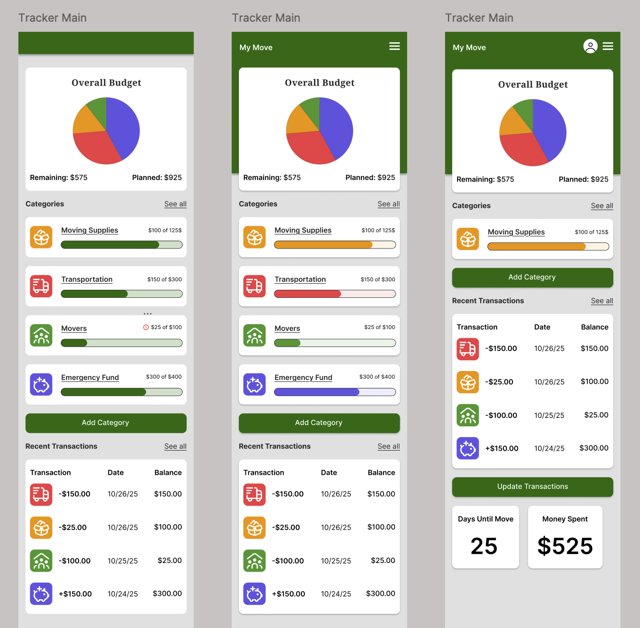
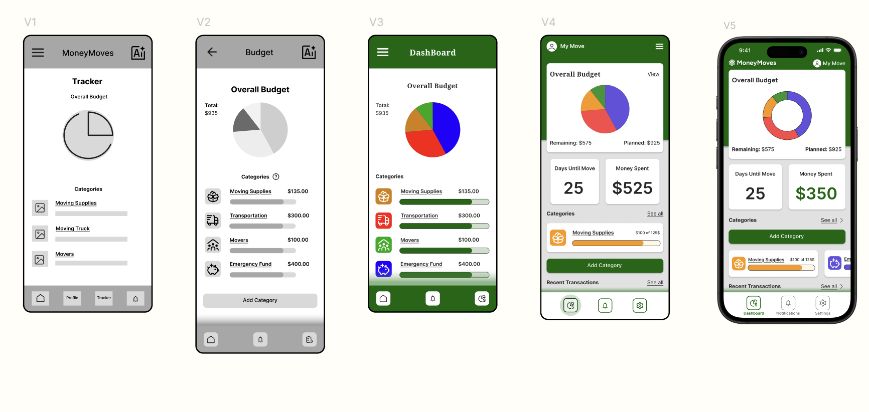
Step 6/8: HiFidelity Wireframes
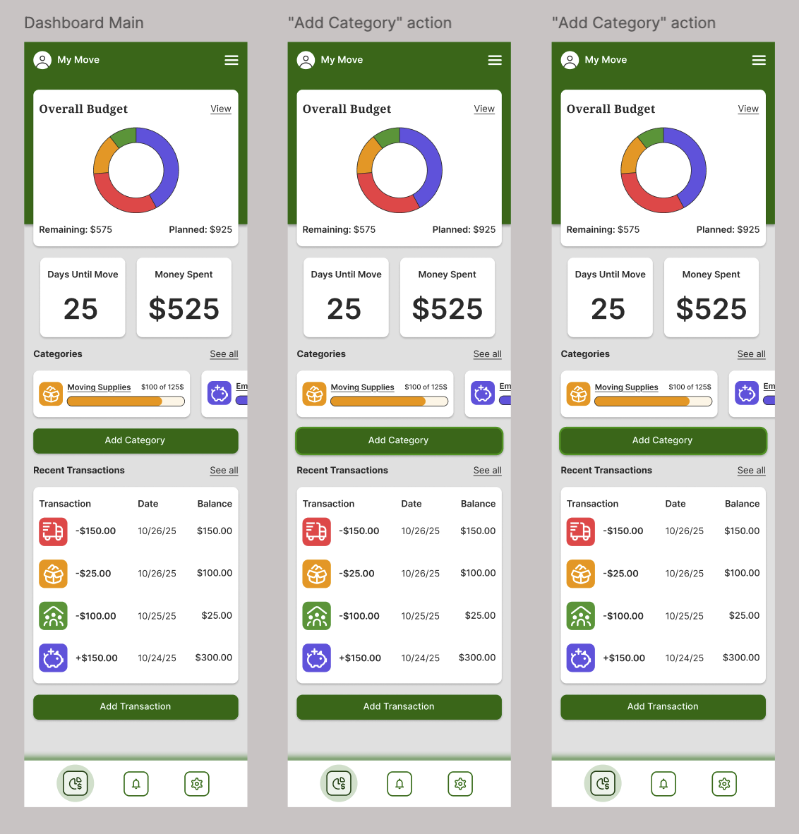
After gathering feedback and iterating on my designs I created HiFidelity frames that represented the most complete version at the time.
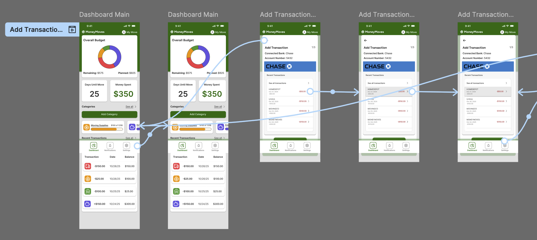
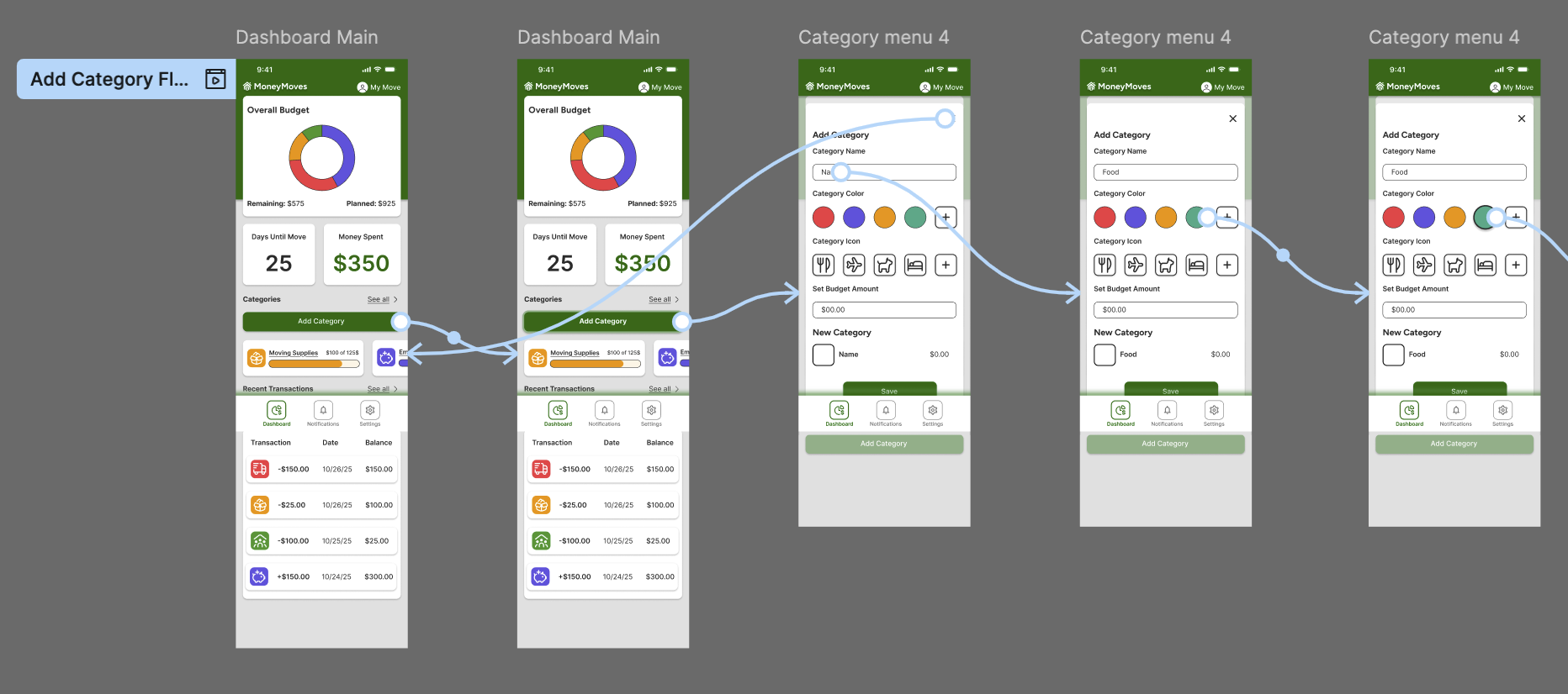
Step 7/8: Prototyping / User Testing
With a solid foundation for the UI of my product I went on to build out key task flows for prototyping.
Flows included:
Adding recent transaction
Adding a budget category
Allocating funds to category
User Testing
I recruited 5 participants with varying technological literacy to test out completing three tasks.
Users completed these tasks in a monitored session in order to gather notes and insights for further iteration.
Add Transaction Flow
Add Category Flow
Step 8/8: Priority Revisions
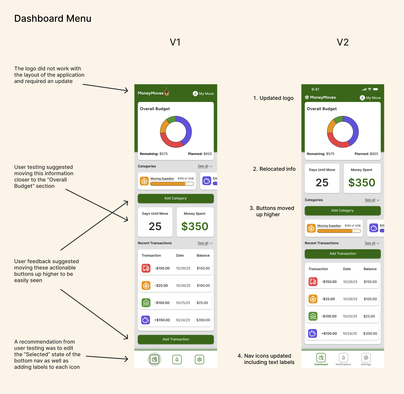
Once I gathered feedback from user testing and prototyping I iterated upon my designs by implementing and testing suggested improvements.
Revisions included and were not limited to:
Updating design and placement of logo
Adjusting location of content
Combining form pages
Relocation of key CTAs
User and mentor feedback was heavily considered and implemented throughout the process of designing each version of the wireframes.
Lofi to Hifi
Next Steps and Lessons Learned
Next Steps
Handoff design to prospective client in a slide deck presentation.
Iterate upon final designs continuing to user test and revise.
Lessons Learned
Through the completion of this project I learned how to prioritize my time and focus on the key components of research and design.
Looking back I would have conducted user testing on earlier versions of my product as a way to generate a more informed direction of my product.
This product was created for the DesignLab UX/UI course. It showcases an in-depth understanding of various user research methods as well as proficiency in user interface practices.